A new front door is on my list of home updates for the summer, and I’m beyond excited! I’m wanting to paint it the perfect “Grandmillennial Blue”, which is my all time favorite color. It’s a super dreamy hue that lands right in between blue and grey, and feels so serene. I adore the Grandmillennial aesthetic, and it seems like anything in a powder blue color is a favorite of designers and influencers in the niche. Here are the 10 paint colors I am loving that give elegant Grandmillennial vibes! It’s so hard for me to decide on a favorite – which is yours?
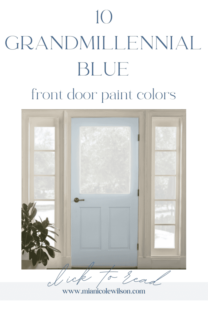
The Best Blue Grey Paint Colors For A Grandmillennial Aesthetic Front Door
Choosing the perfect blue paint color can be very overwhelming! But no fear – I’ve narrowed down the most popular blue-grey paint colors in this post and also added some inspiration pictures of each color used in real life. Pin these to your Home boards on Pinterest for future reference!
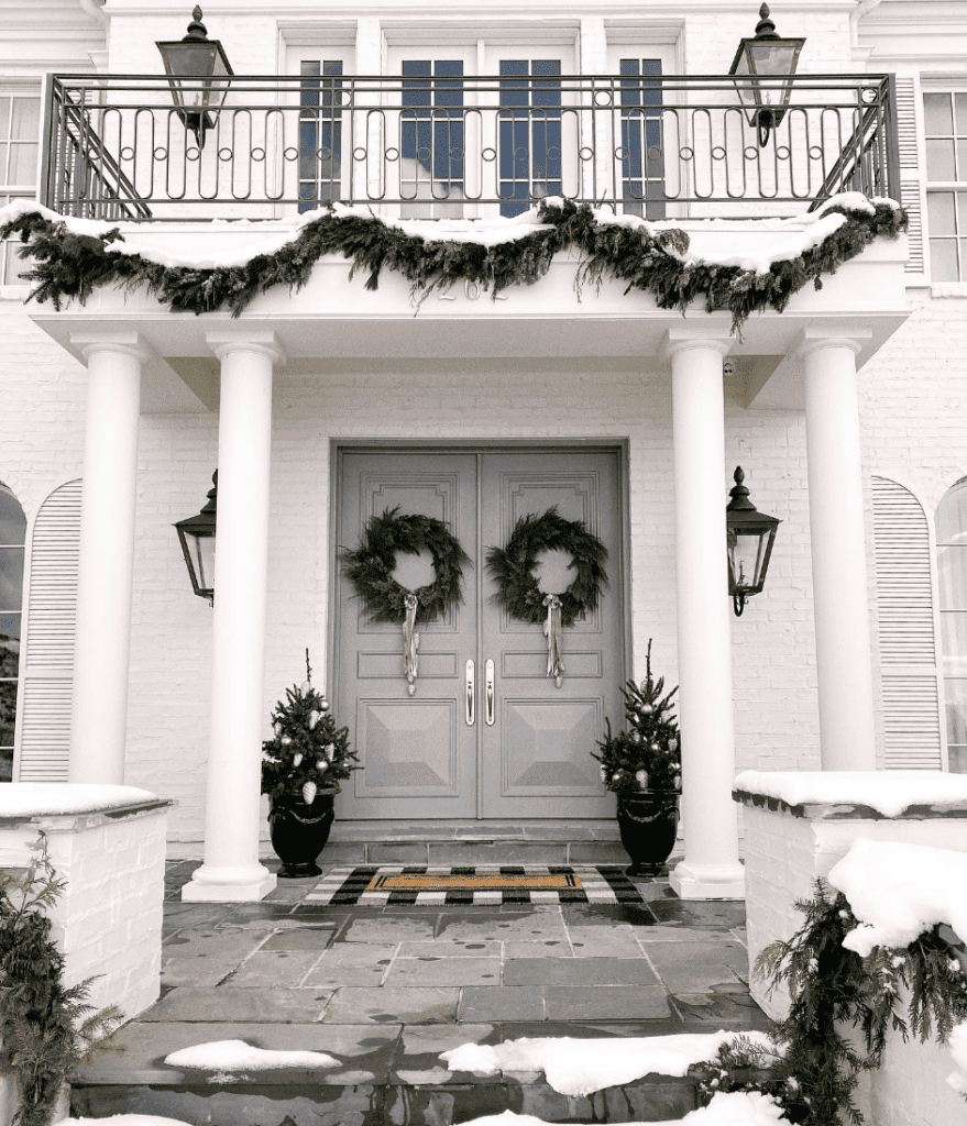
Benjamin Moore Boothbay Gray

I fell in love with this color after seeing Rachel Parcell use it for her grand entryway front doors! It looks so surprisingly green to my eye in the swatch but turns out as the perfect grey-blue. It’s more steely in person which feels neutral and not too loud if you don’t want an aggressive blue hue.
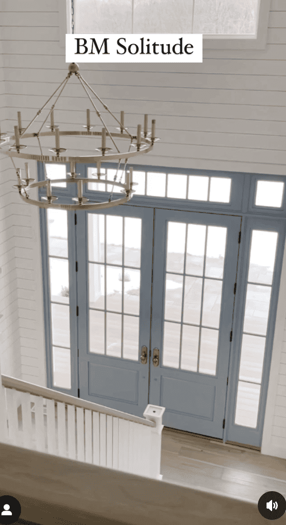
Benjamin Moore Solitude

Solitude definitely looks blue to me in the swatch, so it’s no wonder it goes on pulling more from the blue side when seen on a door or walls. Nina Williams used it on the interior of her home’s front door, and it looks a bright robin’s egg type blue to me. This feels refreshing after having neutrals trending for so long!
Benjamin Moore Quiet Moments

If you are in the mood for a pale, watery blue reach for Quiet Moments! It’s a great lighter color if you don’t want to go too bold, and want to stray away from anything neutral.
When it comes to the above Benjamin Moore hues, I’m liking Solitude because I feel like this color is really nailing the powder blue Grandmillennial vibes that I’m going for.
Sherwin Williams Billowy Breeze
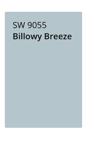
Just like the Solitude paint color mentioned above, go for the Sherwin William version of it in Billowy Breeze! This will leave you with a more saturated blue guaranteed to lift the spirits, and doesn’t veer into a periwinkle hue.
Sherwin Williams Uncertain Grey
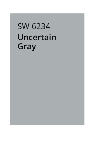
This is a classic color that is sure to look timeless years from now.
Sherwin Williams Lullaby
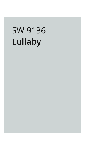
Lullaby is a soft pastel blue, and really lives up to the name! Just imagine this color front door with a beautiful boxwood wreath hanging on it, with a creamy monogrammed bow.
Behr Cumberland Fog
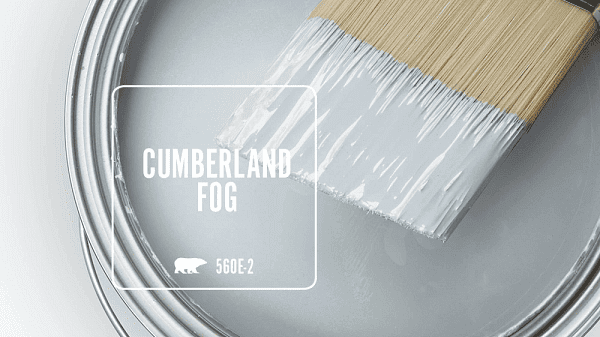
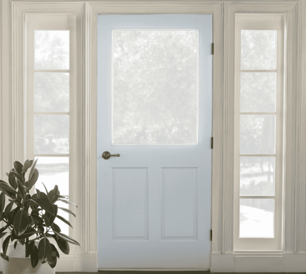
Farrow and Ball Parma Grey
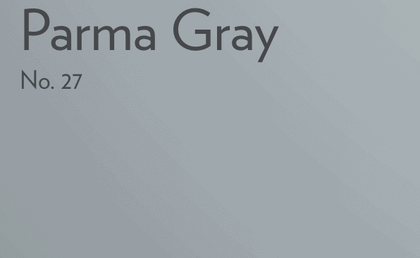
I love how this rich looking color goes with the gold hardware.
Farrow and Ball Lulworth Blue
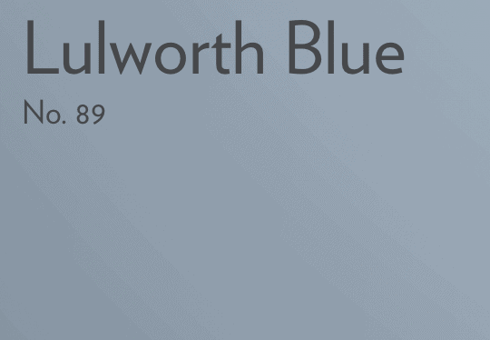
This color is so fun and pretty! We can already see from this picture how great chinoiserie vases look next to it!
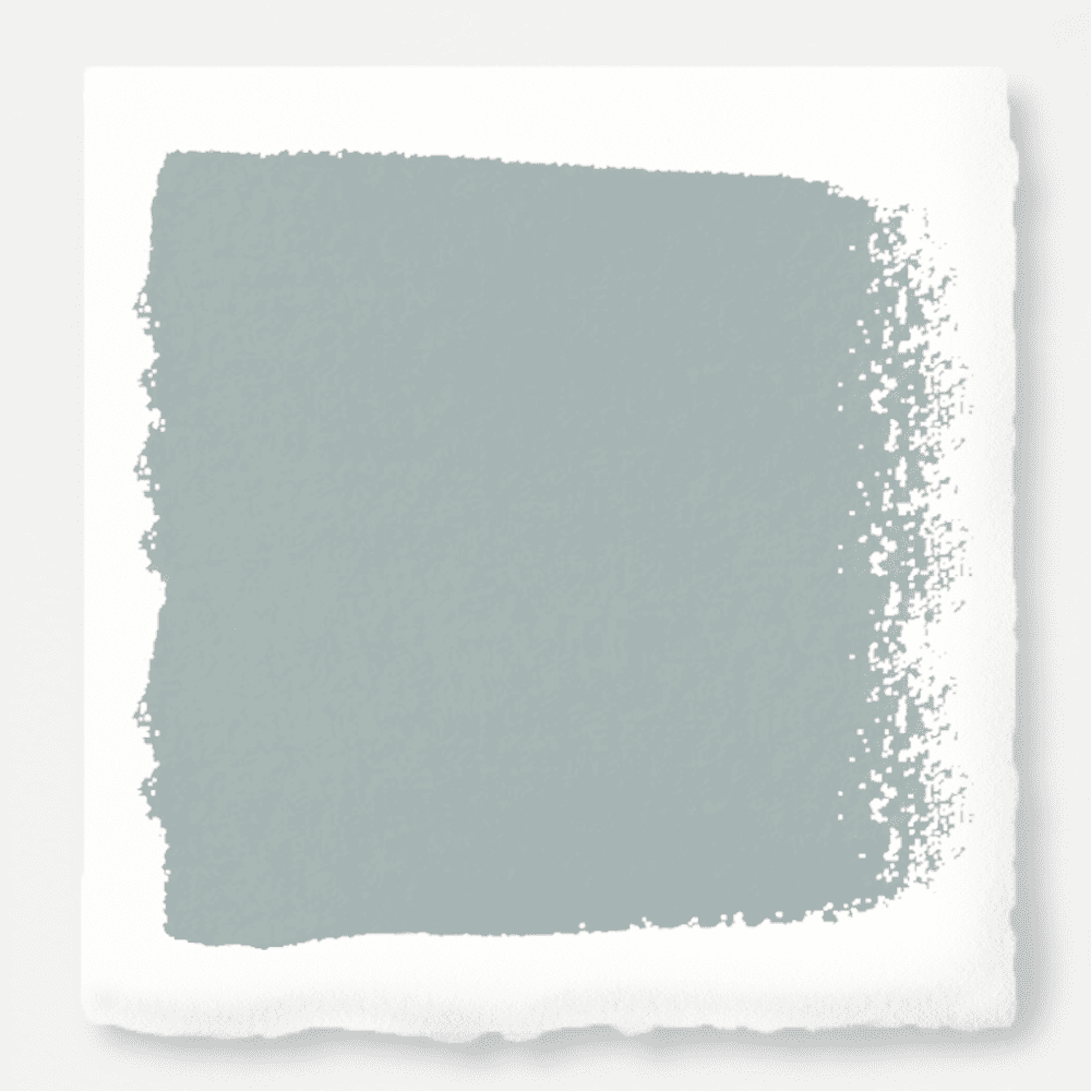
Magnolia Home Paint – Rainy Days
This is another color that looks green in the swatch but looks like the perfect earthy blue on the walls or door.
What To Consider When Choosing Front Door Paint Colors
So what did you think of these hues? All are great options, but there are some things to keep in mind when deciding on a color. Consider the amount of natural light your front door gets. If your door is in a shaded area, you may want to choose a lighter color to make it stand out. The color you love on the swatch might end up looking different when applied. Going lighter could help the overall curb appeal of your home… your front door is one of the first things people see when they approach your home, so you want to make sure it looks inviting and welcoming.
Want more home content? Check out these blog posts:
Best, Mia
